Nên dùng khoảng 20 phút · tối thiểu 150 từ
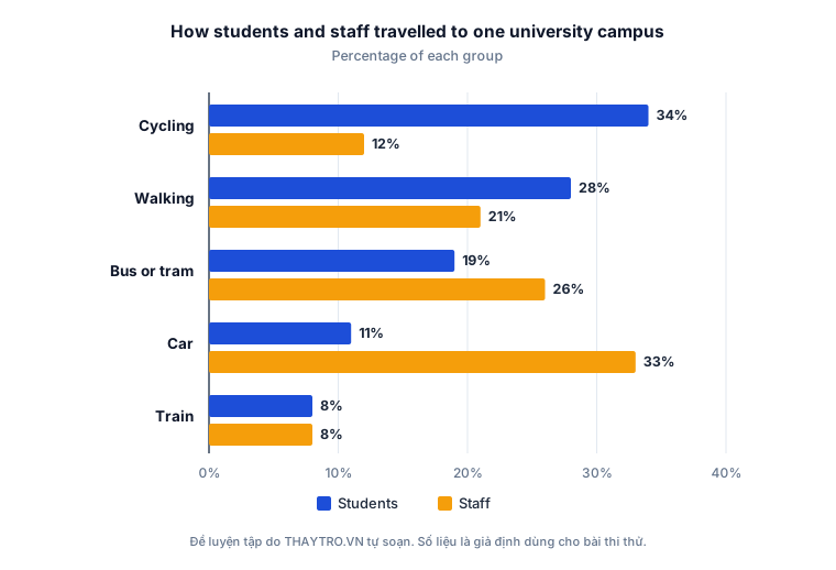
The chart below shows how students and staff at one university travelled to the campus, as a percentage of each group. Summarise the information by selecting and reporting the main features, and make comparisons where relevant. Write at least 150 words.
0 từ · còn thiếu 150 từ so với mức tối thiểu